2025-08-14 — By Siddharth Jain · 7 min read
Creating an Interactive Card UI: A Deep Dive Into Modern Button Design
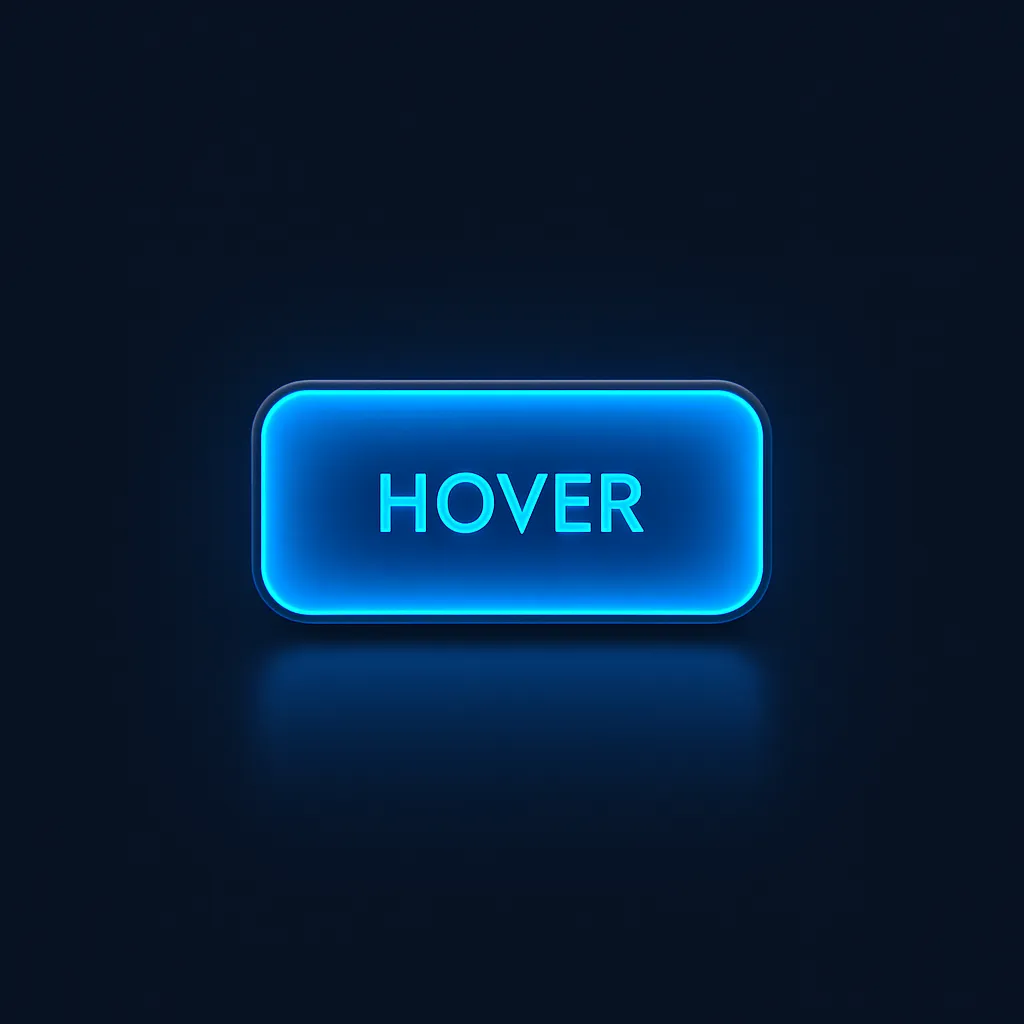
When it comes to web interfaces, interactive cards and buttons are essential for engaging user experiences. Today, we’ll explore a beautifully crafted button UI — the “Watch” button — and explain how each CSS property enhances its look, feel, and interactivity.
1. Button HTML Structure
The HTML couldn’t be simpler:
Watch
This creates a semantic button, which can be easily customized and reused in any card UI.
2. Detailed CSS Explanation
Let’s break down the CSS step by step, focusing on how each element contributes to the design magic.
Core Styling
.btn {
  font-size: 1.2rem;
  padding: 1rem 2.5rem;
  border: none;
  outline: none;
  border-radius: 0.4rem;
  cursor: pointer;
  text-transform: uppercase;
  background-color: rgb(14, 14, 26);
  color: rgb(234, 234, 234);
  font-weight: 700;
  transition: 0.6s;
  box-shadow: 0px 0px 60px #1f4c65;
  -webkit-box-reflect: below 10px linear-gradient(to bottom, rgba(0, 0, 0, 0), rgba(0, 0, 0, 0.4));
}
- font-size: Makes the button text comfortably readable and modern.
- padding: Large vertical and horizontal padding give the button a pill shape and tactile feel.
- border, outline: Removal of borders for a flat, modern look.
- border-radius: Subtle rounding (0.4rem) softens the edges, enhancing approachability.
- cursor: Pointer cursor signals clickability.
- text-transform: Uppercase text for call-to-action emphasis.
- background-color & color: Dark navy background with high-contrast off-white text is visually striking.
- font-weight: Bold text for importance.
- transition: Smooth visual transitions on hover/active for modern, fluid movement.
- box-shadow: Provides depth, making the button float and stand out from the card UI.
- -webkit-box-reflect: Creates a soft reflection below the button for a slick, glassy effect (WebKit browsers only).
Active State
.btn:active {
  scale: 0.92;
}
- scale: Slight shrinking when pressed gives immediate tactile feedback, simulates a “push” effect.
Hover State
.btn:hover {
  background: rgb(2, 29, 78);
  background: linear-gradient(
    270deg,
    rgba(2, 29, 78, 0.681) 0%,
    rgba(31, 215, 232, 0.873) 60%
  );
  color: rgb(4, 4, 38);
}
- Gradient Background: Shifts from dark blue to vivid cyan, adding dynamic visual energy on hover.
- Text Color Change: Deep blue text increases contrast against the brighter background.
- Result: The button feels alive under the mouse, encouraging interaction and reinforcing feedback.
3. How This Button Fits Into Interactive Card UIs
- Visual Anchor: With its shadow and highlight effects, this button draws attention and helps lead users to the card’s primary action (“Watch”).
- Consistency: The use of rounded corners and smooth gradients aligns with modern card UI principles — components should be inviting and visually unified.
- Responsiveness: Transitions and tactile feedback (through hover and active states) keep the interface engaging and satisfying.
4. Accessibility & Customization Tips
- Contrast: The color contrast used here is suitable for most users, but always check with accessibility tools.
- Responsiveness: Consider adjusting padding, font size, and shadows for mobile devices.
- Customization: Easily swap colors or gradient stops to match your site’s palette. Swap out the button text or icon for different card actions.
5. Final Thoughts
By combining concise HTML and thoughtfully layered CSS, you can create a unique, interactive card button that is both visually stunning and highly usable. Every CSS property — from box-shadow to gradients to transitions — plays a specific role in inviting click and improving user confidence.
Use this button directly on your project cards, video previews, image galleries, or dashboards to deliver the kind of tactile, delightful interactions that keep users coming back.