2025-08-13 — By Siddharth Jain · 8 min read
Building an Interactive Activity Card with HTML, CSS, and SVG
Modern dashboards and apps rely on cards—compact UI blocks that group relevant information and make it visually appealing.
In this blog post, we’ll deep dive into building a stylish and interactive activity card from scratch using HTML, CSS variables, and SVG icons.
We’ll go over:
- What this card does and where it can be used
- How the HTML is structured (with SVG graphics)
- How the CSS styling and hover effects work
- How you can customize it for your own project
1️⃣ What is This Card and Why Use It?
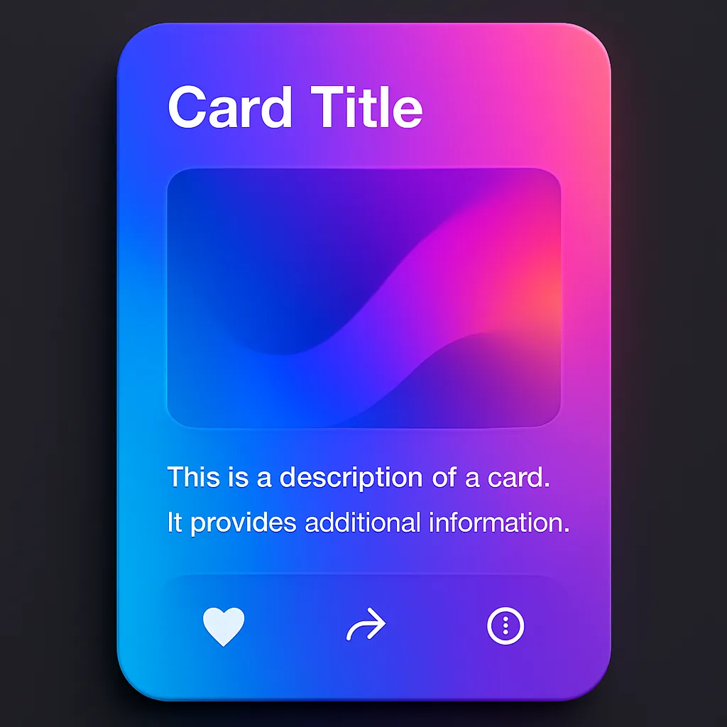
The sample card displays:
- An SVG icon at the top (in a colored header area)
- A title (e.g., "Play")
- Tracked time data (e.g., "32 hrs")
- Last week’s stats for quick comparison
- A hover animation where the top SVG section slides down slightly for a tactile feel
Best Uses:
- Time tracking dashboards
- Activity tracking web apps (e.g., Fitness app, Study tracker, Project management tools)
- Profile activity highlights in social apps
- Gamified progress dashboards
2️⃣ HTML Structure
Here’s the main HTML layout:
Play 32hrs Last Week - 36hrs
Key Parts:
.img-section→ Holds the top SVG icon with background color.card-desc→ Contains title, menu dots, time, and stats.card-menu→ Three small dots often used for a "settings" or "more" menu.card-time→ Main data display.recent→ Last week’s data for context
3️⃣ CSS Styling in Depth
We make heavy use of CSS variables for easy color control:
.card {
  --primary-clr: #1c204b;
  --dot-clr: #bbc0ff;
  --play: hsl(195, 74%, 62%);
  width: 200px;
  height: 170px;
  border-radius: 10px;
  font-family: "Arial";
  color: #fff;
  display: grid;
  grid-template-rows: 50px 1fr;
  cursor: pointer;
}
📌 Highlights:
Top Section - img-section
.img-section {
  background: var(--play); /* aqua-blue */
  border-top-left-radius: 10px;
  border-top-right-radius: 10px;
  transition: transform 0.2s cubic-bezier(0.25, 0.46, 0.45, 0.94);
}
.card:hover .img-section {
  transform: translateY(1em); /* moves down slightly */
}
Creates the sliding hover effect.
Content Section - card-desc
.card-desc {
  background: var(--primary-clr);
  border-radius: 10px;
  padding: 15px;
  position: relative;
  top: -10px;
  display: grid;
  gap: 10px;
}
Visually overlaps with top section for a layered effect.
Menu Dots
.card .dot {
  width: 5px;
  height: 5px;
  border-radius: 50%;
  background: var(--dot-clr);
}
Perfect for minimalist interface menus.
4️⃣ Hover Animation for Interactivity
The .img-section smoothly animates downwards when hovering over the card:
.card:hover .img-section {
  transform: translateY(1em);
}
- Makes the card feel tactile and “alive”
- User gets immediate feedback
5️⃣ How to Customize for Your Project
- Change
--primary-clrfor dark/light theme adaptability - Replace the SVG to match the type of activity (e.g., Music, Work, Exercise)
- Resize card via
widthandheight - Change hover speed via the
transitionproperty - Add click events in JavaScript to link actions or display details
6️⃣ Example Variation – "Work" Card
Just update the CSS variable:
.card.work .img-section {
  background: hsl(15, 100%, 70%); /* Warm orange for work */
}
And change title to Work, icon to a laptop or briefcase SVG.
✅ Final Thoughts
This interactive activity card design:
- Combines clean typography, an SVG icon, and hover animations
- Is highly reusable for different types of data
- Uses pure HTML + CSS (no JavaScript required for the base effect)
- Can be easily themed with CSS variables
You can use multiple instances in a grid for a complete dashboard layout.
💡 Pro Tip: Add box-shadow and slight scale() on hover for an even more dynamic feel.