2025-07-24 — By Siddharth Jain · 6 min read
The HTML Tag: A Complete Guide
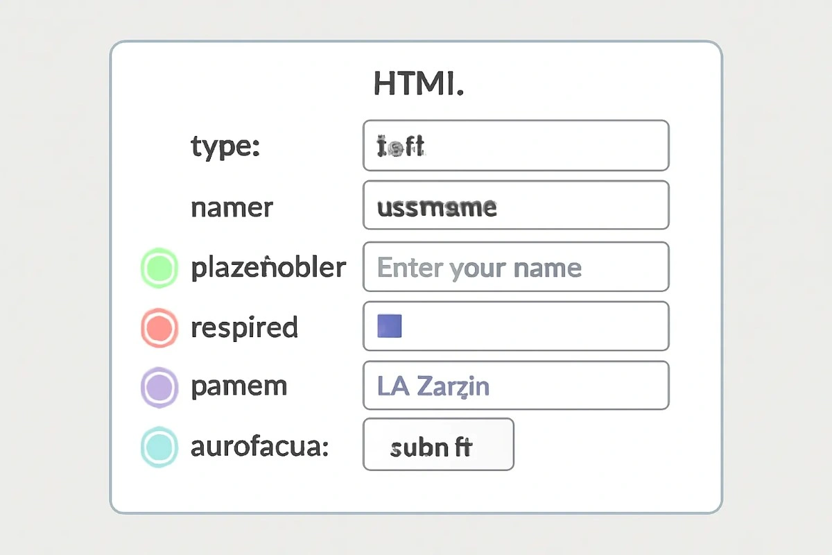
The tag is a fundamental element in HTML, especially when you want to collect user data through a form. It supports various attributes that define its purpose, appearance, and behavior. Here’s a clear and beginner-friendly explanation of all important attributes.
🔑 What Does the Tag Do?
The tag is used in forms to collect data from users. It allows you to create text fields, email fields, password boxes, date pickers, file uploads, checkboxes, radio buttons, sliders, and more.
✅ Essential Attributes
1. type
Determines what kind of input is expected.
| Value | Purpose |
|---|---|
| text | Single-line text |
| Email address | |
| password | Concealed (dots) password |
| number | Number only |
| date | Date picker |
| file | File upload |
| checkbox | Tick box |
| radio | Single choice (from many) |
| range | Slider input |
| submit | Submit button |
| reset | Form reset button |
2. name
Gives a name to the field for form submission (used by the server).
<input type="text" name="username" />
3. value
Sets the default or current value in the input box.
<input type="text" value="Hello" />
4. placeholder
Displays helper text that shows what the user should enter.
<input type="email" placeholder="Enter your email" />
5. required
Makes the input field mandatory. The form cannot be submitted without filling this.
<input type="text" required />
6. readonly
Shows the input, but the value cannot be changed by the user.
<input type="text" value="Read only" readonly />
7. disabled
Completely disables the input—users cannot interact with it.
<input type="text" disabled />
8. min and max
Set minimum and maximum values for number, date, or range fields.
<input type="number" min="1" max="100" />
<input type="date" min="2024-01-01" max="2025-12-31" />
9. maxlength and minlength
Control the maximum and minimum length of textual input.
<input type="text" maxlength="10" minlength="3" />
10. pattern
Specifies a regular expression pattern the input value must match.
<input type="text" pattern="[A-Za-z]{3,}" title="At least 3 letters" />
11. step
Defines the increment between allowed values for number or range inputs.
<input type="number" min="0" max="10" step="2" />
12. autocomplete
Controls whether the browser should suggest autofill options for the input.
<input type="text" name="name" autocomplete="off" />
13. autofocus
Automatically focuses this field when the page loads.
<input type="text" autofocus />
14. multiple
Allows selection of more than one value for file or email inputs.
<input type="file" multiple /> <input type="email" multiple />
🔍 Full Example: Login Form
Below is a complete example that demonstrates multiple `` attributes in a form:
<form>
  <label>Email:</label>
  <input
    type="email"
    name="user_email"
    placeholder="example@mail.com"
    required
    maxlength="30"
    autofocus
  />
  <br />
  <label>Password:</label>
  <input type="password" name="user_pass" minlength="6" required />
  <br />
  <input type="submit" value="Login" />
</form>
📋 Final Tips
- Use the correct
typefor the kind of input you need. - Add
nameattributes so your backend can process the data. - Make forms user-friendly with
placeholder,required, andautocomplete. - Set logical limits with
min,max,maxlength, andpatternto ensure data quality. - Enhance accessibility with
readonly,disabled, andautofocuswhere suitable.
With these attributes, you can build any kind of interactive web form you want—all in a simple, maintainable, and user-friendly way.