2025-08-15 — By Siddharth Jain · 6 min read
How to Build an Animated CSS Watch UI: Step-by-Step Beginner’s Guide
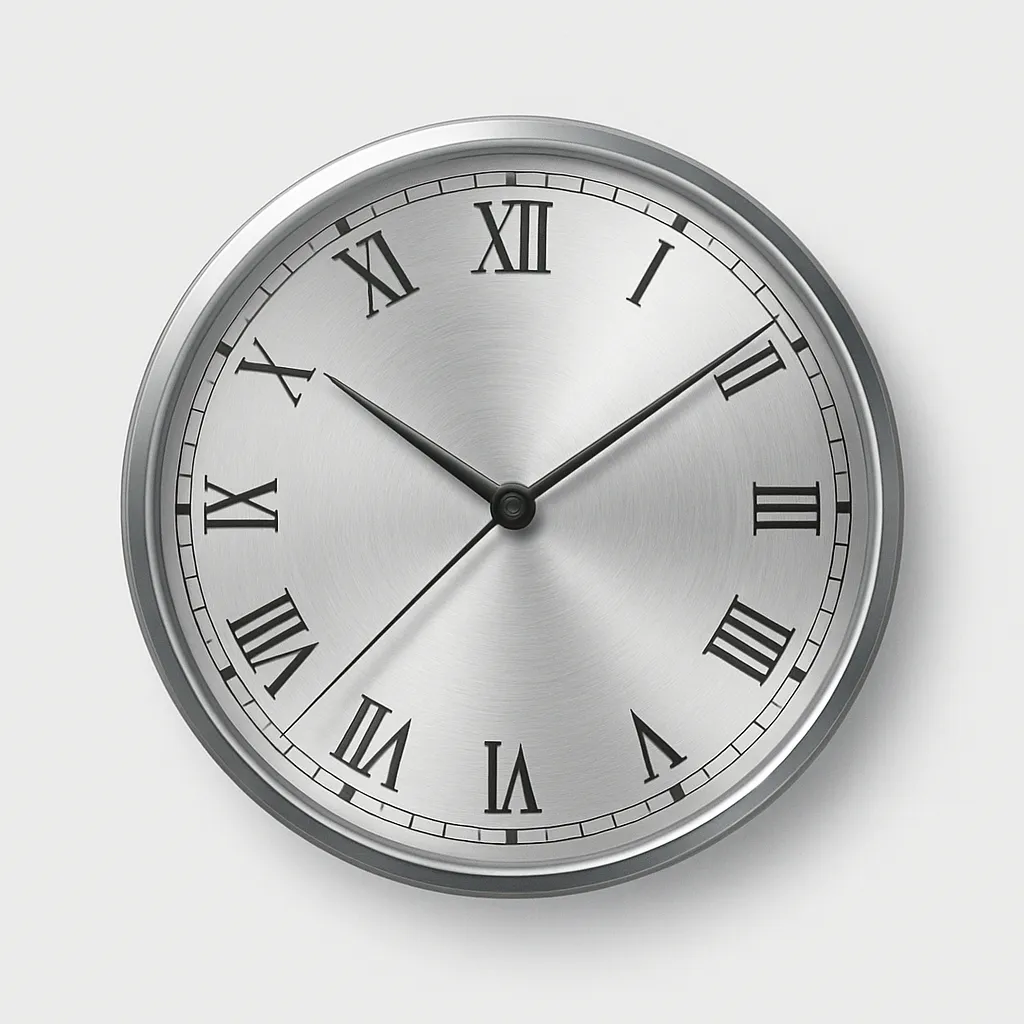
Want to add a stunning animated watch face to your web project? This blog explains everything you need to know to build a visually rich clock—using only HTML and CSS. No images, no JavaScript—just pure creativity and modern web techniques.
🎨 What Is an Animated CSS Watch UI?
An animated CSS watch UI is a visual clock made with HTML for the structure and CSS for the design and movement. The hands rotate smoothly; gradients, shadows, and borders create realistic effects. It’s perfect for dashboards, demos, or unique decorative components!
🛤️ Full Step-by-Step Guide
1. HTML Structure: The Foundation
Start by creating the basic elements of your clock:
II II
.face: Circular container for the clock face..v-indexand.h-index: Simulated Roman numeral markers.- Nested
.handelements: Used for stacking & organizing clock hands.
2. CSS In-Depth: Styling & Animating
Below is a breakdown of the code and design logic:
Watch Face Styling
.face {
  position: relative;
  width: 180px;
  height: 180px;
  border-radius: 50%;
  outline: 10px solid #333;
  background: repeating-radial-gradient(
      circle at 50% 50%,
      rgba(200, 200, 200, 0.2) 0%,
      rgba(200, 200, 200, 0.2) 2%,
      transparent 2%,
      transparent 3%,
      rgba(200, 200, 200, 0.2) 3%,
      transparent 3%
    ), conic-gradient(white 0%, silver 10%, white 35%, silver 45%, white 60%, silver
        70%, white 80%, silver 95%, white 100%);
  box-shadow: inset 0 0 20px #0007;
}
- Circular shape and thick outline create a visually strong rim.
- Layered gradients give a metallic, luminous vibe.
- Inner shadow adds depth.
Clock Hands Styling & Animation
Hour Hand
.hour {
  position: absolute;
  width: 5px;
  height: 60px;
  background: #aaa;
  left: 87.5px;
  top: 43px;
  border-radius: 3px 3px 1px 1px;
  transform-origin: 2px 47px;
  box-shadow: 0 0 5px #0005, inset 1.5px 3px 0px #333,
    inset -1.5px -3px 0px #333;
  z-index: 1;
  animation: watch 432s linear infinite;
}
- Positioned to rotate from the dial's base.
- Metallic gradients evoke real watch hands.
- The animation simulates movement through the day (scaled for demo).
Minute Hand
.minute {
  position: absolute;
  width: 4px;
  height: 78px;
  background: #aaa;
  left: 88px;
  top: 25px;
  border-radius: 3px 3px 1px 1px;
  transform-origin: 2px 65px;
  box-shadow: 0 0 5px #0005, inset 1.5px 3px 0px #333,
    inset -1.5px -3px 0px #333;
  z-index: 2;
  animation: watch 36s linear infinite;
}
- Longer and thinner than hour hand.
- Rotates faster; constantly in motion.
Second Hand
.second {
  position: absolute;
  width: 10px;
  height: 10px;
  background: red;
  left: 85px;
  top: 85px;
  border-radius: 50%;
  border: 1px solid #eee;
  z-index: 3;
  animation: watch 0.6s steps(60, end) 0s infinite;
}
.second::before {
  content: "";
  position: absolute;
  width: 1px;
  height: 85px;
  left: 3px;
  bottom: -10px;
  background: red;
  border-radius: 2px;
  box-shadow: 5px 0 2px rgba(128, 128, 128, 0.2);
}
.second::after {
  content: "";
  position: absolute;
  width: 4px;
  height: 4px;
  left: 2px;
  top: 2px;
  background: #555;
  border-radius: 50%;
}
- Red dot forms the hand’s center.
::beforeadds the thin, long second hand.- Fast-stepped animation creates a ticking effect.
Indices (Clock Markers)
.v-index,
.h-index {
  position: absolute;
  color: #333;
  font-size: 24px;
  text-shadow: ...;
  z-index: 1;
}
.v-index {
  left: 83.5px;
  top: -3px;
  text-shadow: 0 157px 0 #333;
}
.h-index {
  left: 5px;
  top: 72px;
  transform: rotate(-90deg);
  text-shadow: 0 158px 0 #333;
}
- Positioned to mimic 12 and 3 o’clock markers.
- Rotation and shadowing increase realism.
Animation Keyframes
@keyframes watch {
  0% {
    transform: rotate(0deg);
  }
  100% {
    transform: rotate(360deg);
  }
}
- Each hand rotates at a different speed for dynamic motion.
3. How It Works: Behind the Scenes
- Positioning: Each hand is precisely placed using absolute positioning and
transform-originso rotation feels natural. - Layering/Visual Depth:
box-shadowand gradients add realism—to both the face and the hands. - Animation: CSS keyframes rotate each hand with distinct timing, creating immersive clock movement.
- No Images or JS: 100% CSS: you can tweak colors, animation speeds, even add more markers or transforms.
🛠️ Essential Knowledge & Tips
| Category | How It’s Done |
|---|---|
| Layout | HTML ``s, CSS positioning |
| Visuals | CSS gradients, shadows, borders |
| Animation | CSS @keyframes, infinite rotation |
| Layering | z-index and nested elements |
| Customization | Resize, color tweaks, more indices, accessibility |
📈 Creative Extensions
- Make digital or analog versions.
- Add ticking sound effects with JS.
- Resize for widgets, dashboards, or app intros.